Landing Page Redesign

Visual/Web design
Overview
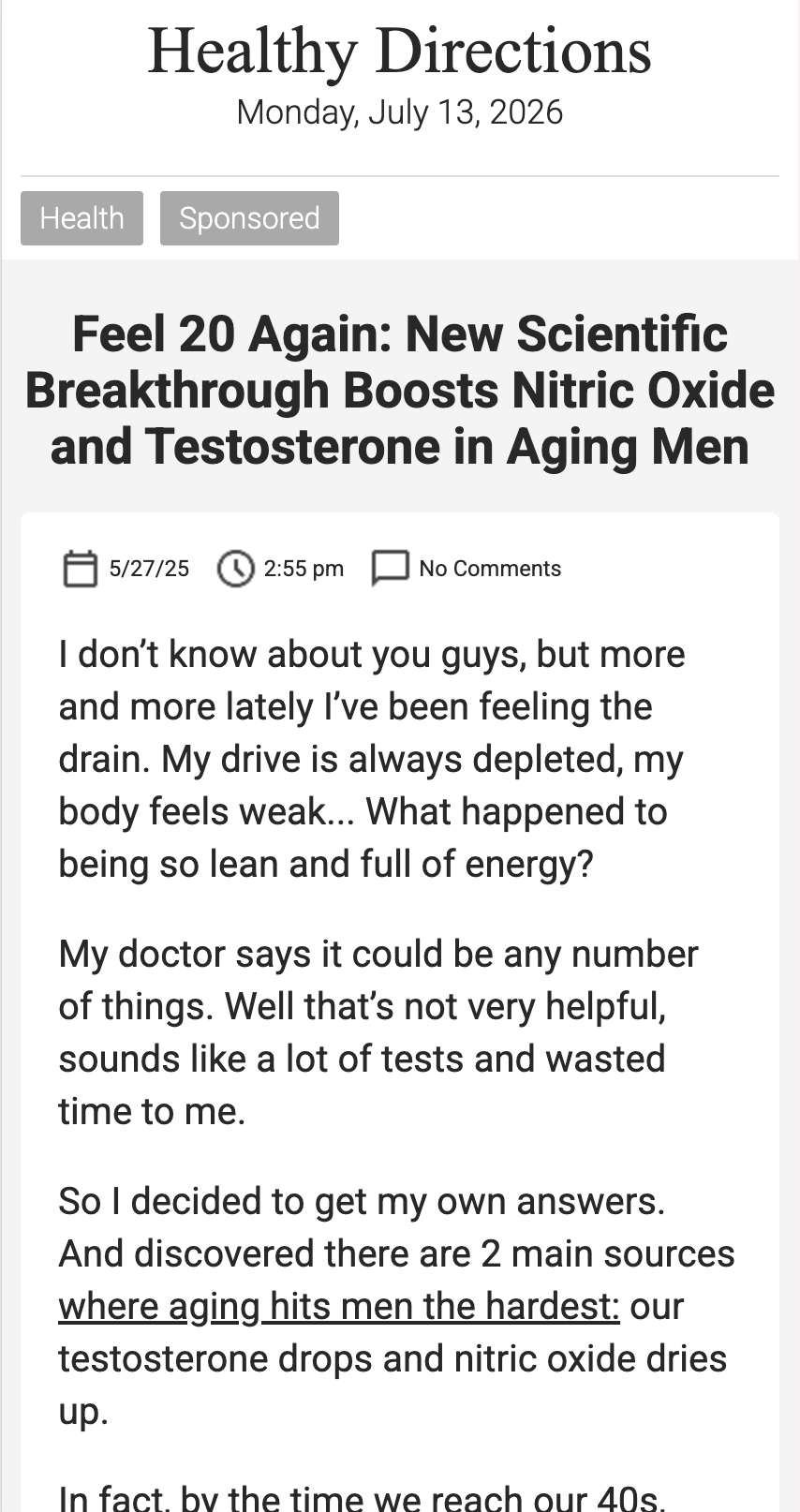
The existing presale experience had become dated and difficult to navigate. The pages followed a blog-style layout with long-form copy, making it difficult for users to quickly understand the product's value proposition or take action.

I partnered with the Conversion Optimization, Product, and Development teams to redesign multiple presale pages, creating a more modern, modular experience focused on clarity, visual hierarchy, and user engagement.

‍Role: Senior Designer
Team: Marketing, Backend Engineering, Analytics
Scope: UX/UI Design, Visual Design, Creative Asset Creation, Figma Mockups

The Problem
The previous presale pages presented several usability issues:
  • Long blocks of text created cognitive overload
  • Important product benefits were buried within the content
  • The layout lacked a clear visual hierarchy
  • The design no longer reflected the quality of the brand
  • Components were difficult to reuse across campaigns
The goal wasn't simply to refresh the visual design, it was to create an experience that helped users understand the product more quickly while giving internal teams greater flexibility to optimize future campaigns.
Business Context
  • Primary acquisition channel: Paid media
  • Mid/high traffic volume
  • Variations of the same content were untested
  • Marketing needed more flexibility to test messaging variations
Any improvements would have direct revenue impact.
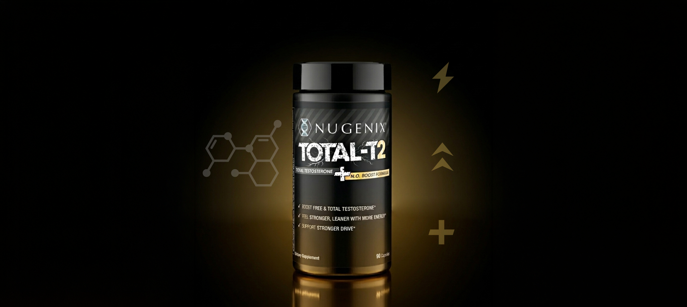
Old version:
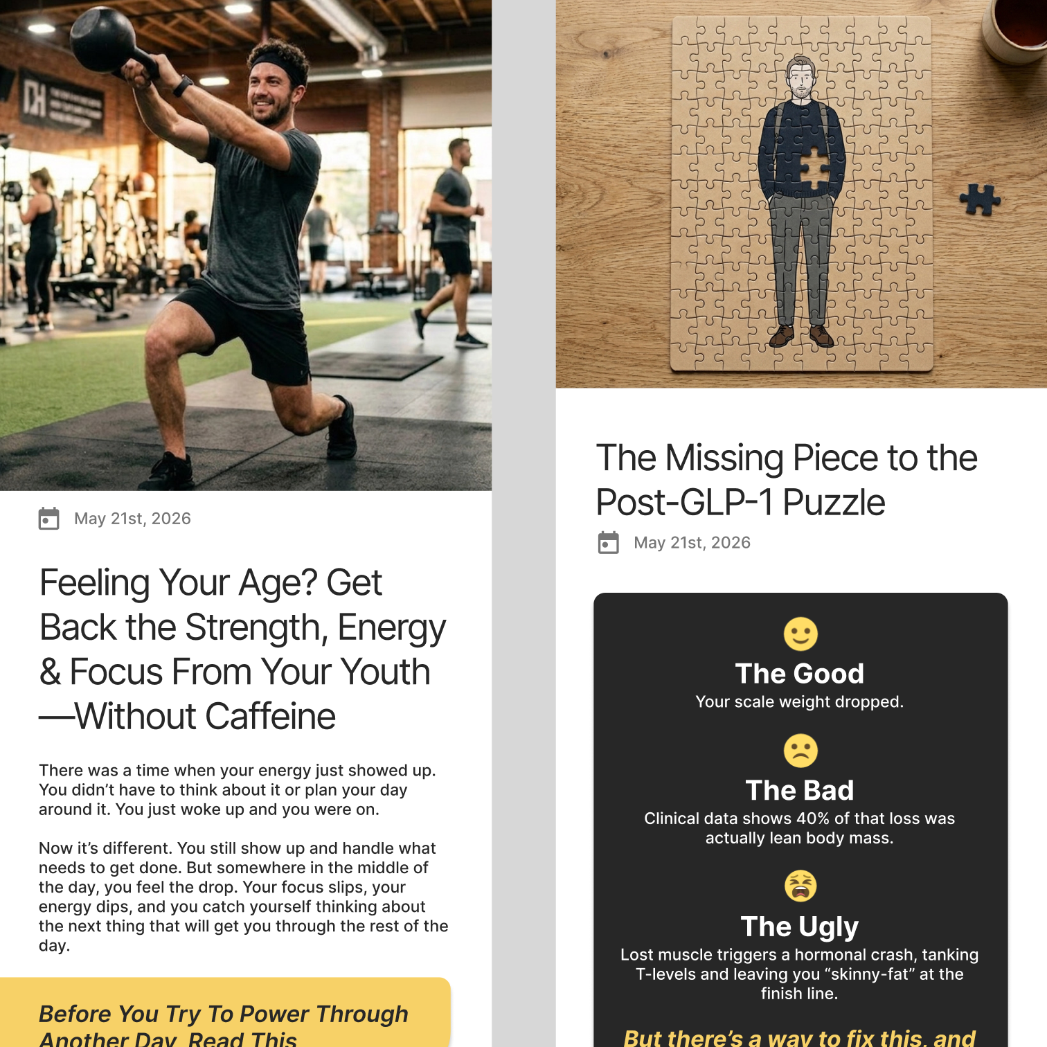
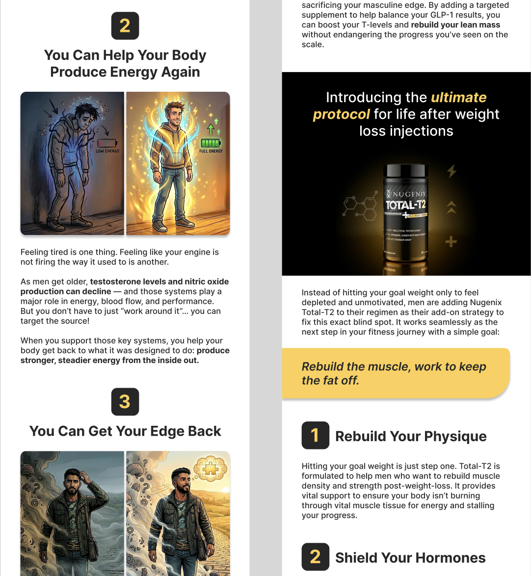
New versions:
My Role & Ownership
I owned the visual and UX design of the redesigned presale experience.
  • Designing high-fidelity mockups in Figma
  • Creating all supporting creative assets and illustrations
  • Establishing a modern visual direction
  • Working with the Conversion team to prioritize messaging hierarchy
  • Partnering with Product to ensure the experience aligned with broader customer goals
  • Collaborating with developers throughout implementation to ensure design quality and feasibility
This wasn’t just visual polish, it was structural improvement.
Design Strategy
1. Design for Scalability
Rather than designing individual pages in isolation, I created reusable components and creative assets that could support future presale campaigns.

This reduced design inconsistency and gave marketing teams greater flexibility when launching new products or testing messaging variations.
2. Modern, More Visual Layout
  • Cleaner layouts
  • Improved spacing
  • Stronger typography hierarchy
  • More engaging imagery
  • Consistent visual components
The redesign modernized the experience while reinforcing trust and credibility.
3. Increase Scannability
  • Clear section headers
  • Visual grouping
  • Strong call-to-action placement
  • Supporting graphics that reinforced messaging
This made information easier to consume without sacrificing important details.
Figma Board
Design Deliverables
Throughout the project I produced:
  • High-fidelity Figma mockups
  • Custom visual assets and supporting graphics
  • Reusable UI components
  • Design specifications for development handoff
Every change was tied to reducing friction and improving conversion clarity.
Collaboration
This project required close collaboration across multiple disciplines. I partnered with:
  • Conversion Optimization to prioritize messaging, user flow, and content hierarchy.
  • Development to build functionality, code, and assist in implementing in backend CMS
  • Copywriting/legal to provide copy and review legality of claims
Working cross-functionally allowed us to balance business goals, technical constraints, and user experience throughout the project.
Results
We made intentional tradeoffs between persuasion and clarity.
  • Conversion rate increased 15-20%
  • Improving content organization and readability
  • Creating a more modern and engaging visual experience
  • Simplifying the user journey through clearer hierarchy
  • Delivering reusable design assets for future campaigns
Even beyond measurable metrics, the page became:
  • Easier to maintain
  • Easier to test
  • Faster to iterate on