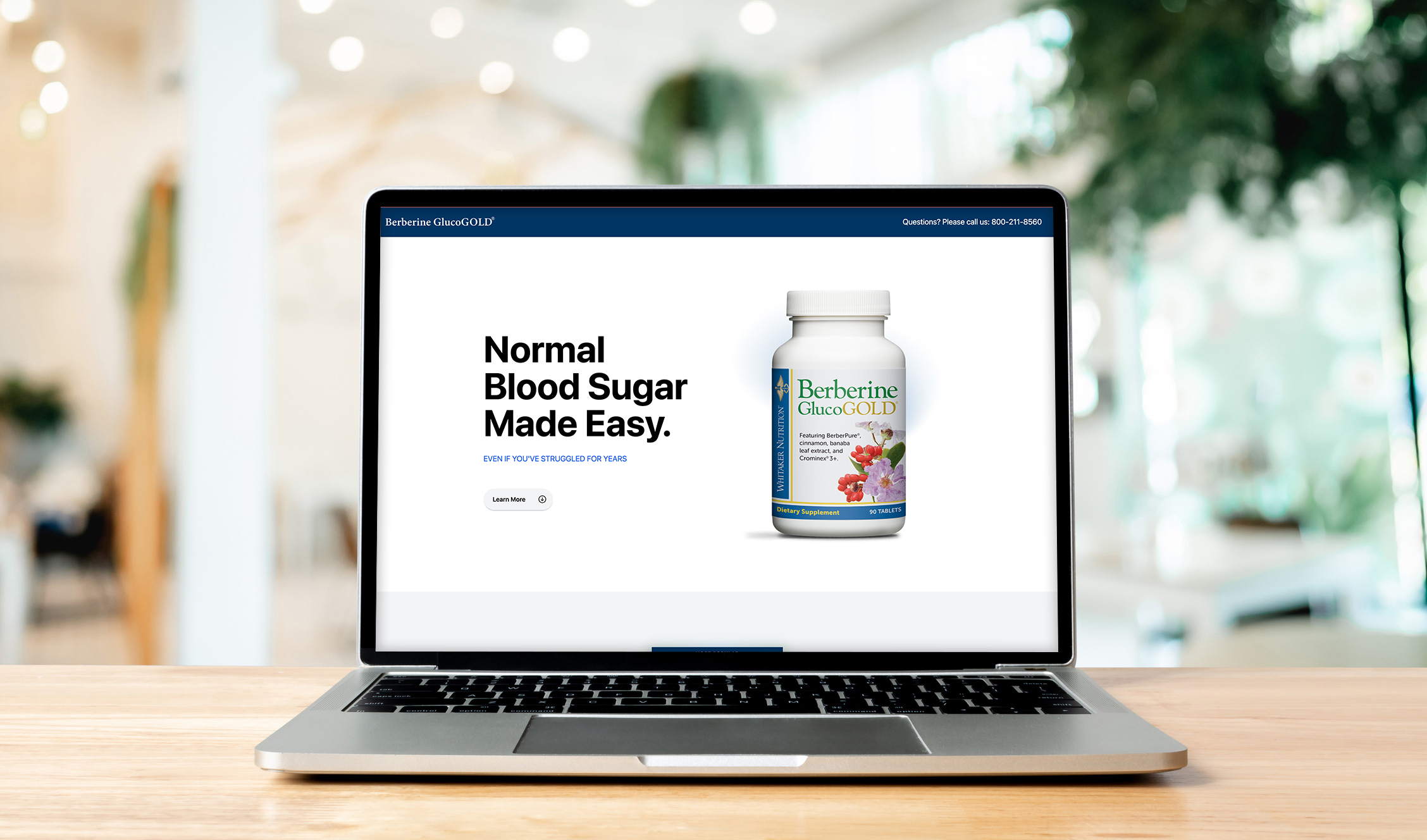
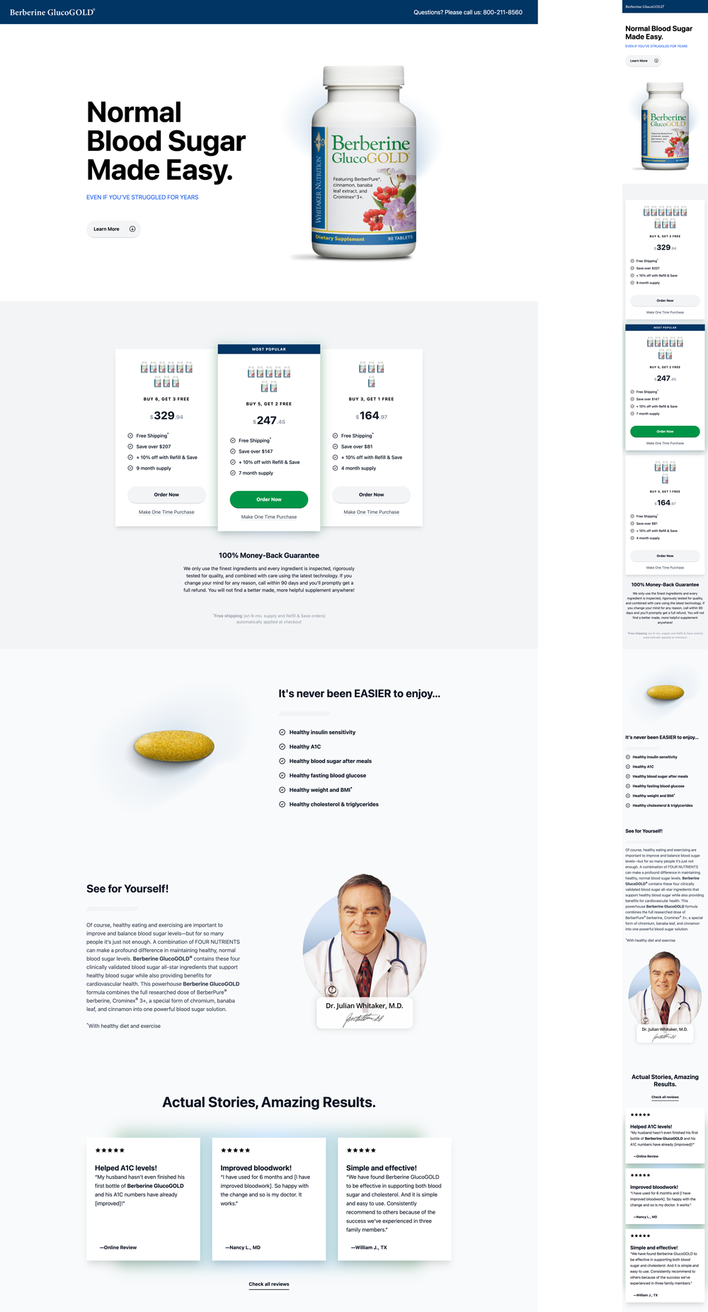
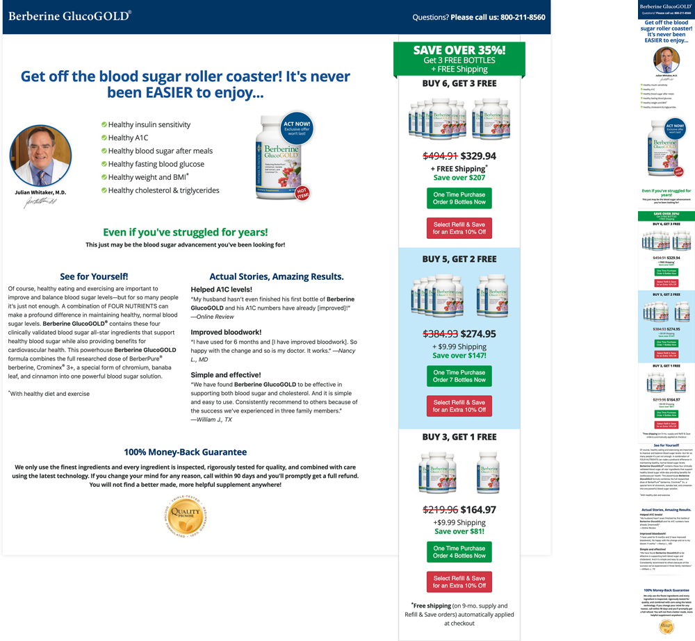
I wanted to minimize the amount of things fighting for attention first. There were way too many CTAs, and I know presenting too many options to potential customers is a big no-no. I broke out the offers from the right column and into its own section beneath a hero image of the product. It is important to present a little information at a time so the user isn't overwhelmed.
The offer becomes more clear and inviting, while limiting CTAs and subliminally providing a suggestion for the best offer. I followed similar principles with the rest of the sections, giving everything some room to breathe and easier to read by breaking up copy with images.
I created some custom images in Photoshop to give the page a more interesting and appealing feel. The colorful blur behind various elements is continued throughout, and keeps the page visually appealing while not distracting too much from the product.