Misc. Designs

Logos, marketing stuff, and everything in between
Wellful
The parent company for Healthy Directions, Nutrisystem, Nugenix, and a few others went through a rebranding and reached out to employees across all companies to help out with a new logo. They wanted both a long version and a condensed icon version that was consistent with the "healthy" theme across all brands. My design was selected as a finalist, although it didn't end up winning :(
Grow
This logo was for another project I was working on in my free time. It's mostly just a fun concept I was using to stretch some creative muscles, but I liked what it turned into. Blending a simple leaf graphic with a "g" keeps things straightforward and easy to recognize. I liked the green gradient to give the leaf aspect a little pop, but not too much to distract.
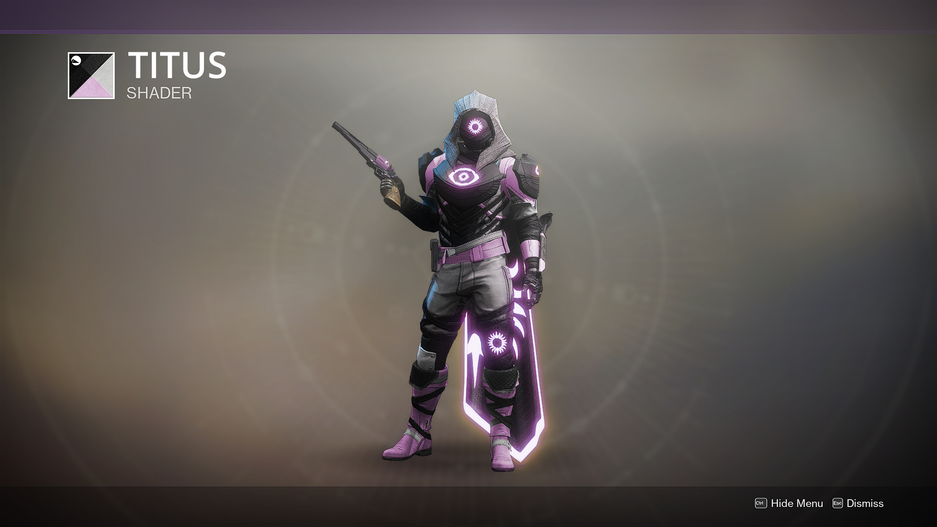
Destiny 2 Shader
This was just for fun. I used to play the game Destiny 2 quite a bit, and I was always bothered that the color scheme I wanted my character to be wasn't present in the game. So I took to photoshop and created my own. I nice hint of light pink for my otherwise perfect guardian.
Phantoms
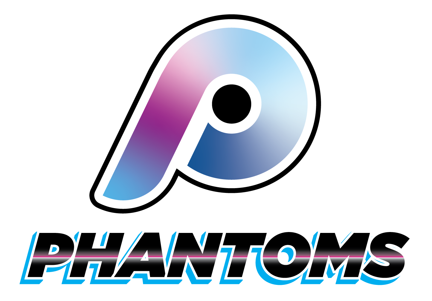
This logo was for a local hockey team. There is a strong Philadelphia contingent amongst the players, so they wanted that to show in the logo. I kept the current orange coloring, and blended the Flyers (professional ice hockey team) logo with that of the Phillies (professional baseball team) to keep it familiar but new at the same time.

They also wanted a second version for alternate jerseys, so I worked up a "Miami Vice", retro-futuristic version of the same logo.
Maryland Mayhem
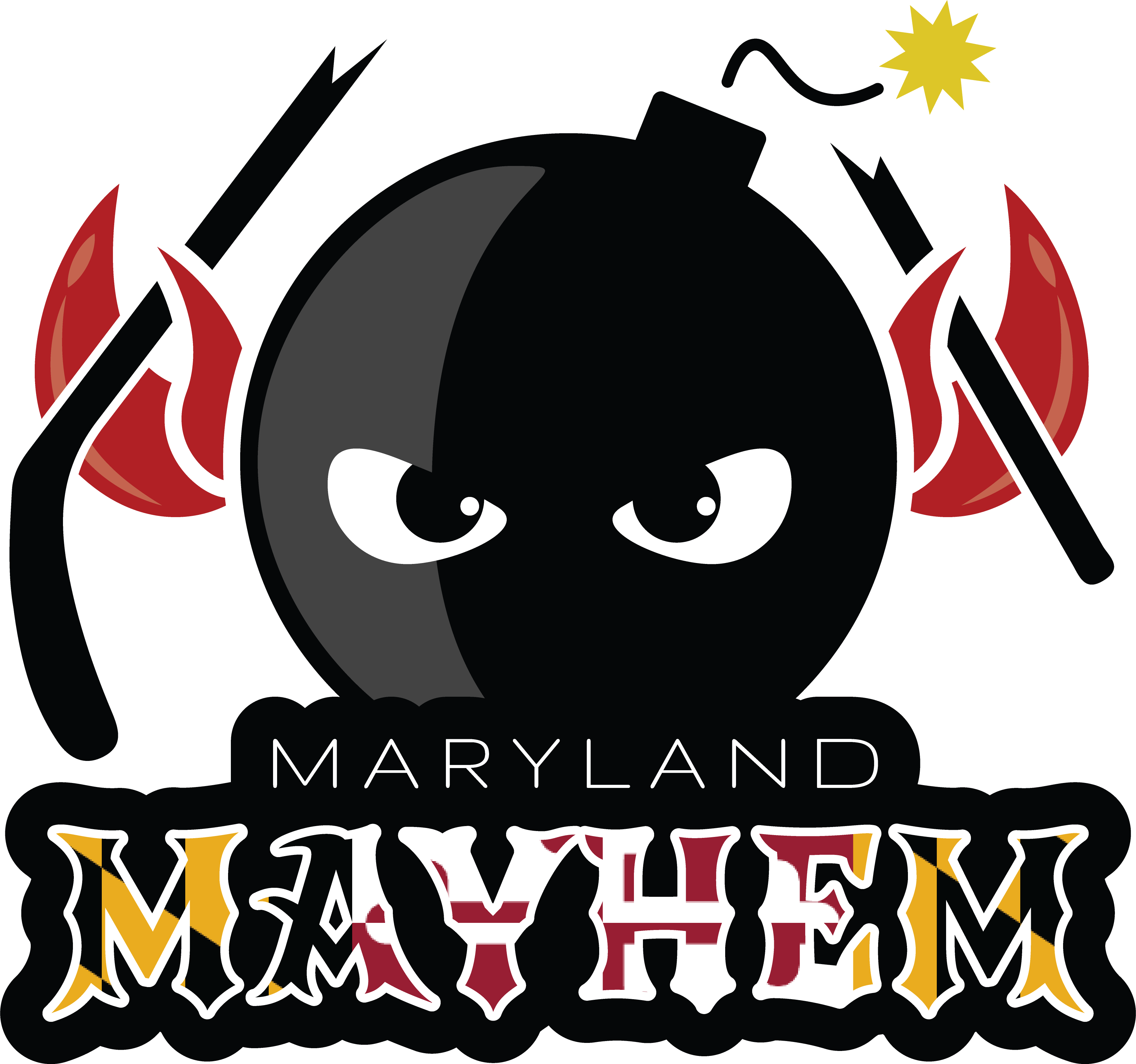
Another hockey team logo... This one was for a coed team in Maryland. Nobody loves Maryland colors more than people from Maryland, so they wanted to make sure that was part of the design. A classic bomb design symbolizes mayhem, and giving it some crab claws and eyes makes it feel like more of a mascot than random assortment of items. It didn't win any awards, but received many compliments across different hockey tournaments
Rove
This was one of a few designs for a friend building an app called "Rove". It had something to do with travel, hence the pin and dotted line.
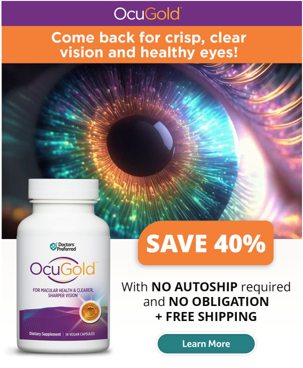
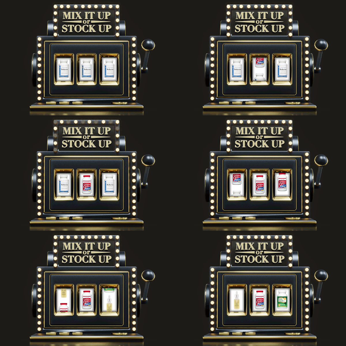
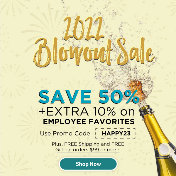
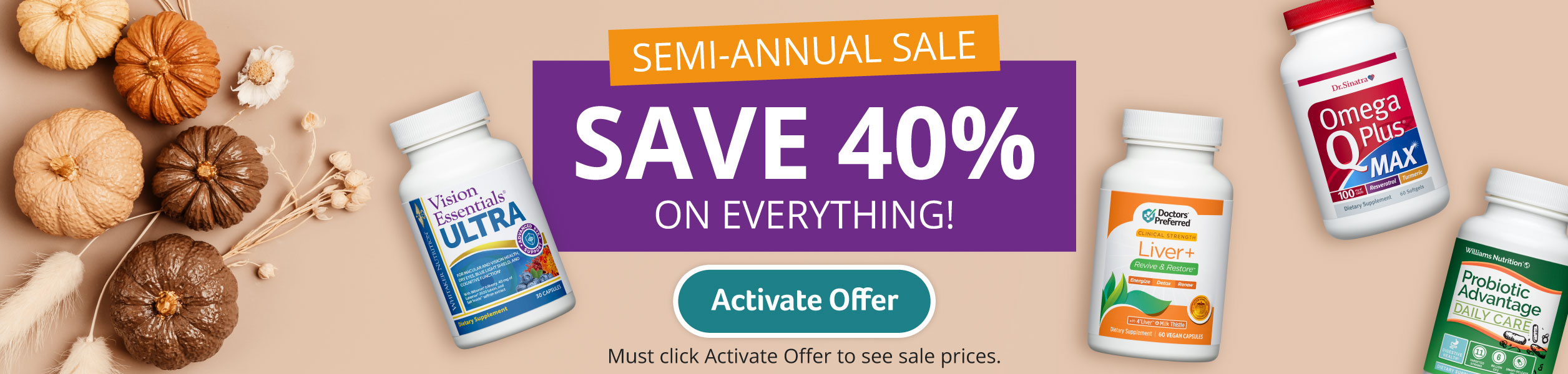
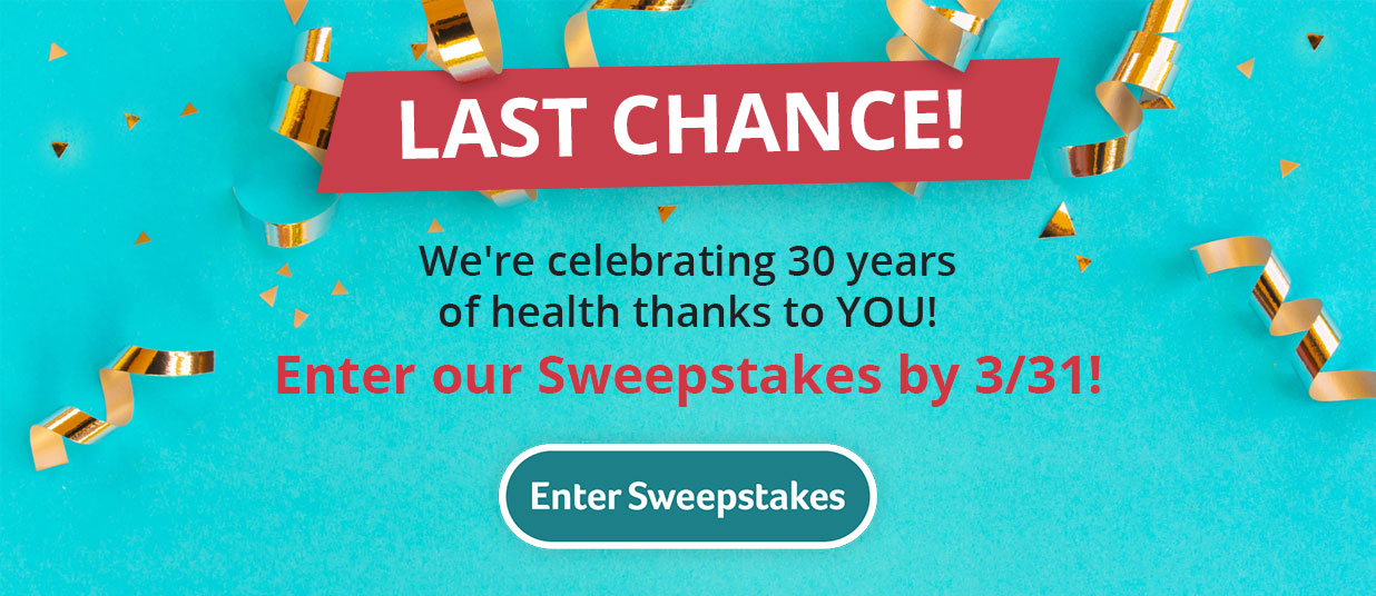
Marketing Promotions
Thoughts?
I'm happy to share more work samples if there is something missing, or something specific you'd like to see. Feel free to drop me a line and let me know what you think!