Mobile App Design

Designing a Scalable UX System from Concept to High-Fidelity
Overview
I designed a mobile application experience focused on creating a seamless, intuitive user journey from onboarding through core task completion.

My work centered on UX strategy, front-end interface design, and building a cohesive visual system that could scale as the product evolved.

‍Role: Lead Product Designer (UX & UI)
Scope: User journeys, information architecture, design system, high-fidelity mockups
Platform: iOS / Mobile

The Problem
The app aimed to help users accomplish caring for their plants in an easy, efficient, and central location but early concepts lacked:
  • Clear user flow structure
  • Hierarchy between primary and secondary actions
  • Cohesive visual identity
  • Scalable component system
  • Consistent interaction patterns
Without strong UX foundations, the product risked:
  • Cognitive overload
  • Feature sprawl
  • Low engagement
  • Poor retention
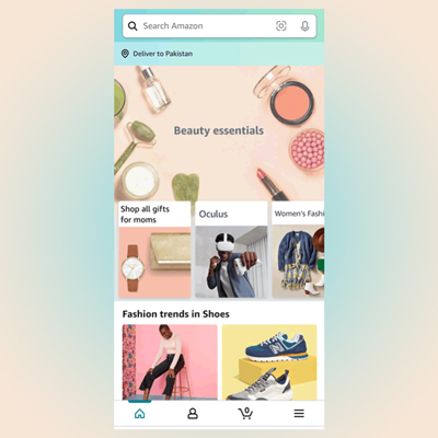
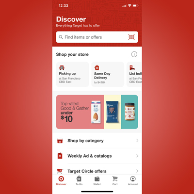
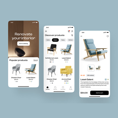
Mood board
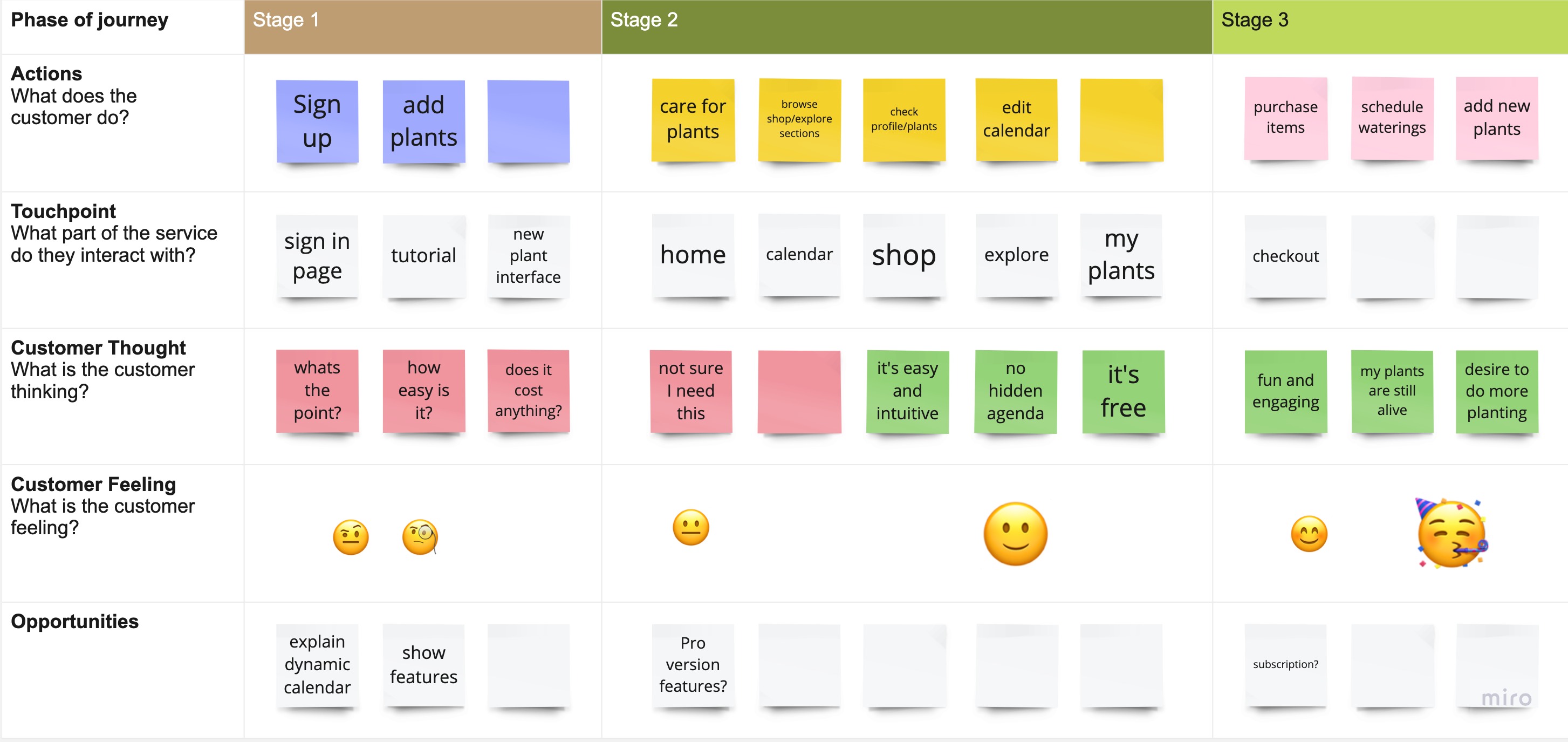
Discovery & User Journey Mapping
Before moving into visual design, I focused on understanding how users would navigate the product.

I created detailed user journey maps to:
  • Identify friction points
  • Define primary vs. secondary flows
  • Clarify onboarding steps
  • Reduce unnecessary navigation depth
This helped prioritize:
  • The app’s primary action
  • Progressive disclosure of advanced features
  • A simplified navigation structure
My Role & Ownership
I led the UX and front-end design strategy from early concept through high-fidelity prototype. I was responsible for:
  • Mapping user journeys and core flows
  • Defining information architecture
  • Establishing visual direction and mood
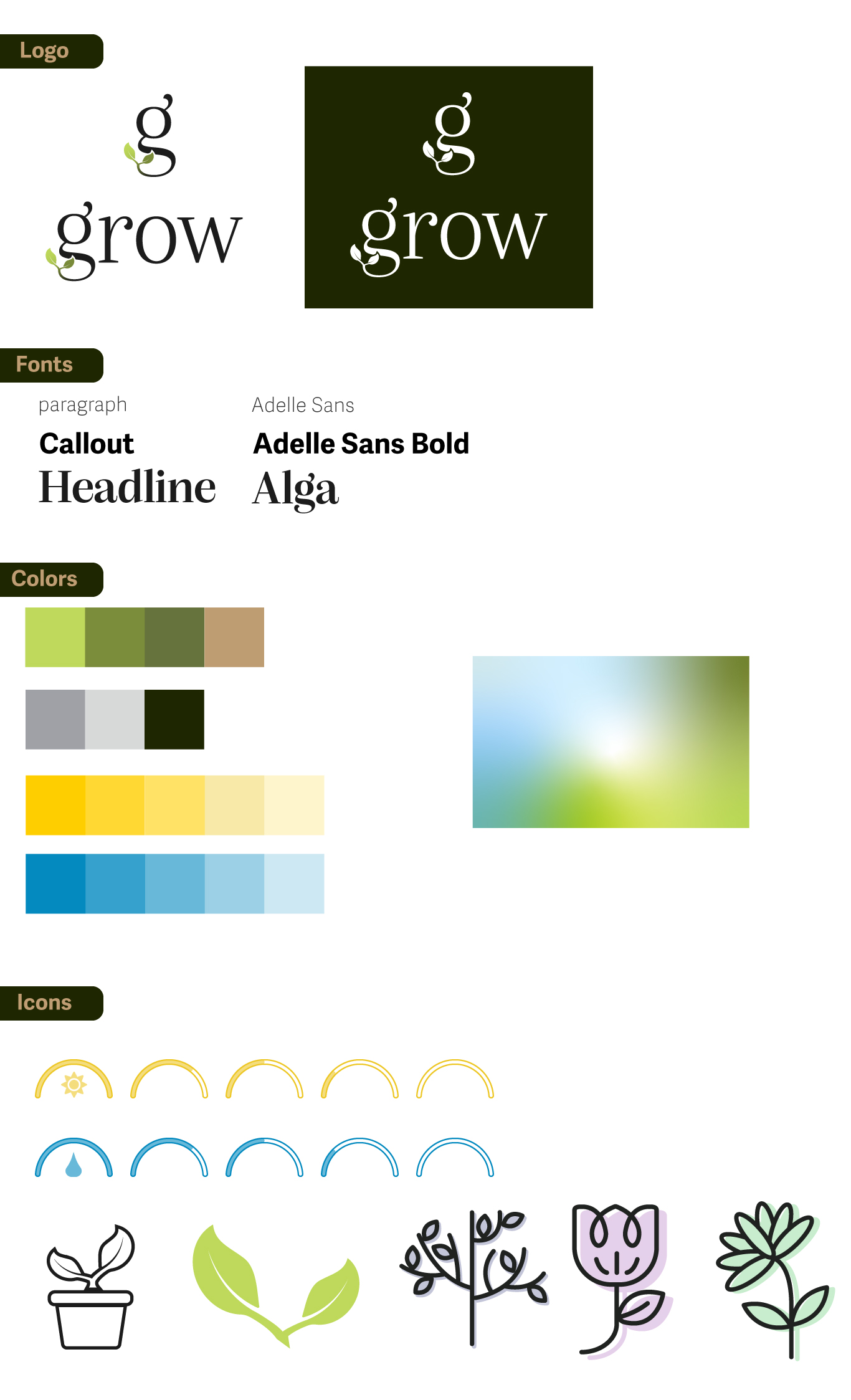
  • Creating a scalable style guide
  • Designing high-fidelity UI mockups
  • Ensuring consistency across screens and states
UX Strategy
1. Clarity Over Feature Density
Focused on minimizing cognitive load by surfacing one primary action per screen.
2. Progressive Disclosure
Advanced functionality was layered thoughtfully to avoid overwhelming new users.
3. Consistency & Predictability
Established repeatable interaction patterns to reduce learning friction.
Visual Direction & System Design
Rather than designing screens individually, I created a foundational visual system.
Design Decisions & Tradeoffs
Several strategic decisions shaped the final product:
  • Reduced dashboard complexity to focus on core action.
  • Limited bottom navigation to essential tabs to avoid clutter.
  • Limited bottom navigation to essential tabs to avoid clutter.
  • Designed reusable components to accelerate future feature development.
Each decision balanced usability, scalability, and visual cohesion.
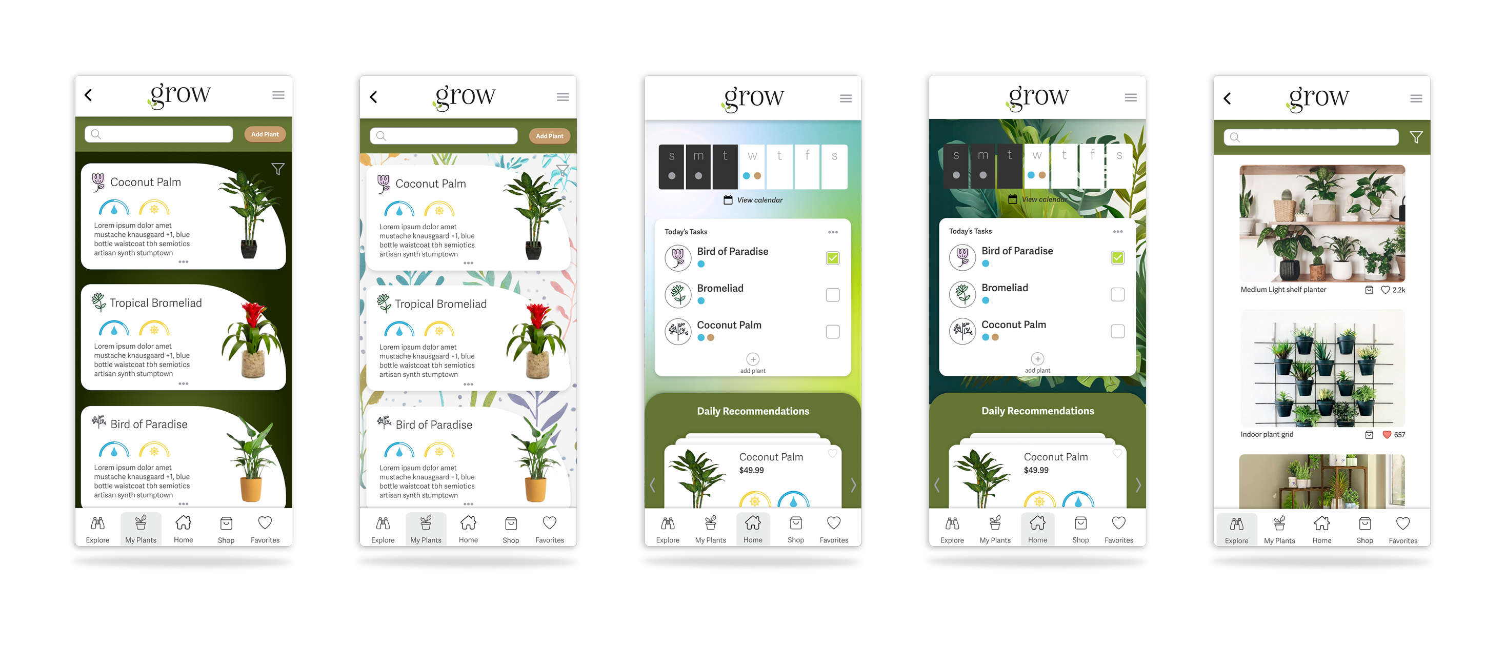
High-Fidelity Mockups
The final interface emphasized:
  • Clean hierarchy
  • Generous spacing
  • Accessible color contrast
  • Consistent iconography
  • Strong visual grouping
If This Were Launched
If taken to production, I would validate:
  • Onboarding completion rate
  • Task success rate
  • Time to first meaningful action
  • Feature adoption patterns
  • Retention after first week
Future iterations would focus on optimizing engagement through lightweight experimentation and usability testing.
  • Easier to maintain
  • Easier to test
  • Faster to iterate on