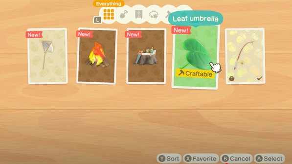
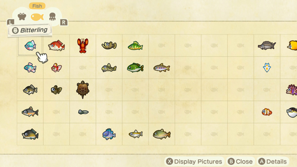
A case study for the game Animal Crossing to further understand the UI/UX design process as it pertains to games. This project was completed as a part of the ELVTR UI/UX Design for Gaming course.
Challenges
Short time line
Limited knowledge of the game
Matching different content with existing art styles
My Role
UX/UI design, User Testing, Visual Design
Tools
Figma, Illustrator, Photoshop, Firefly
Timeline
7 weeks
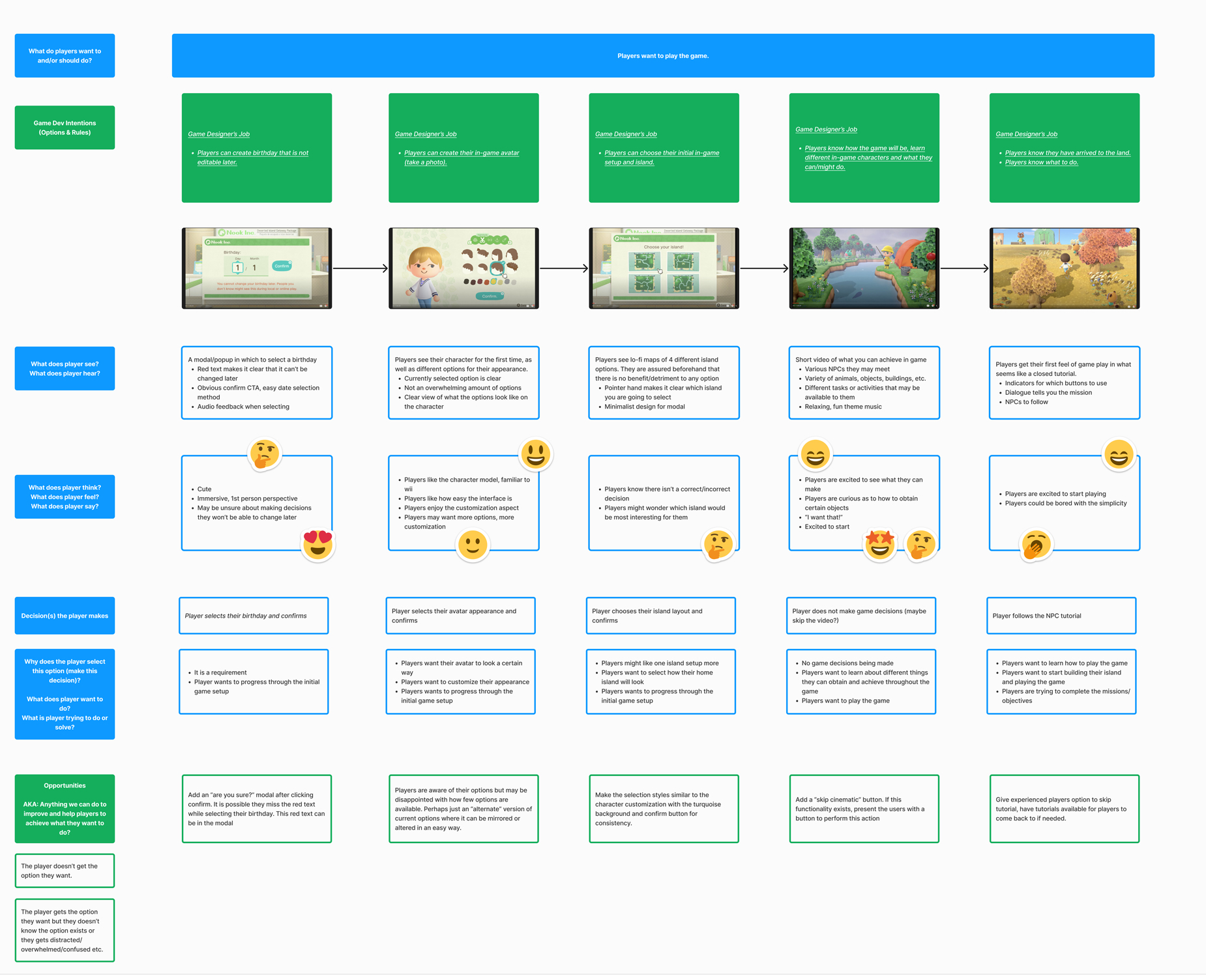
Player Journey
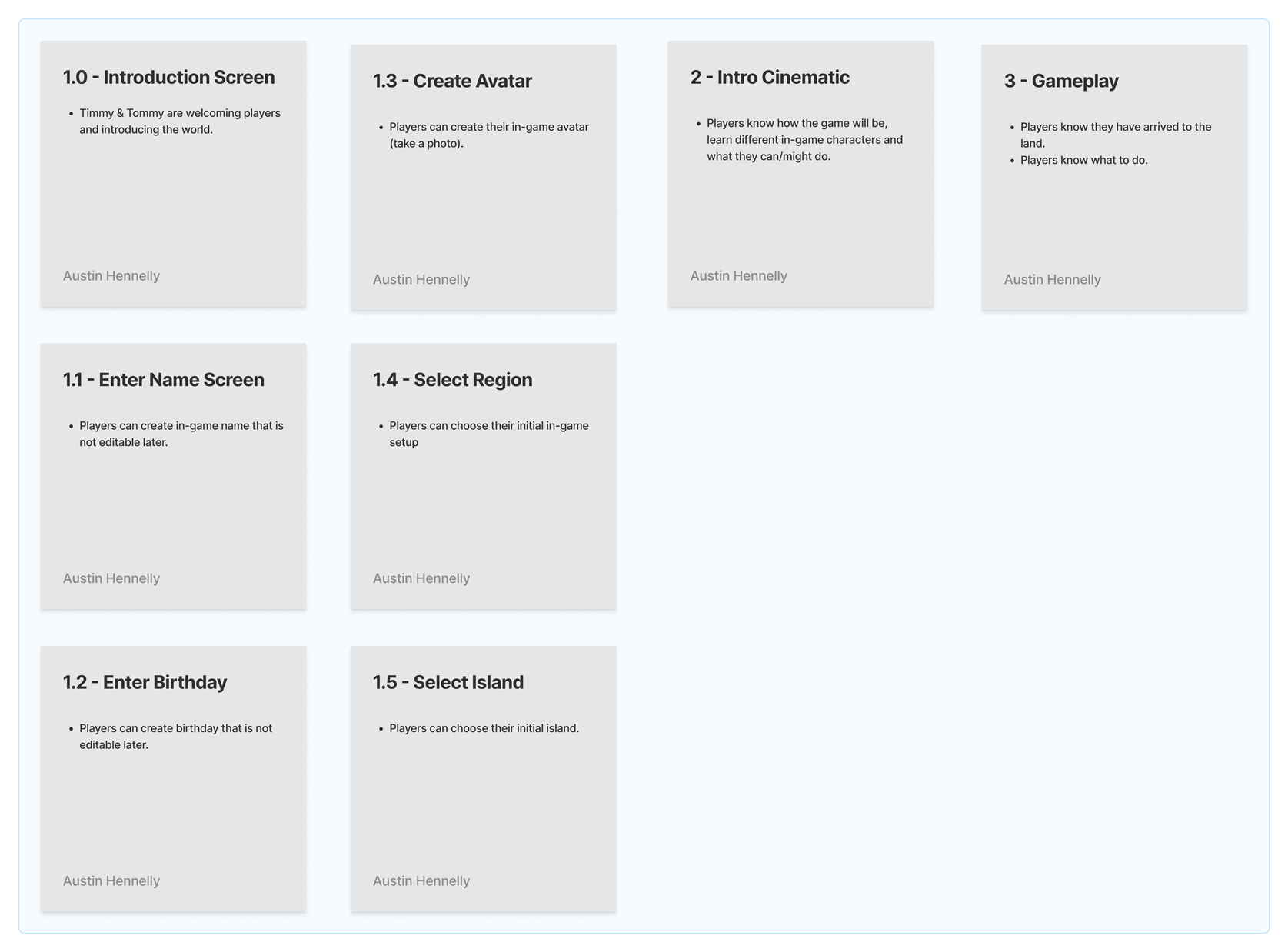
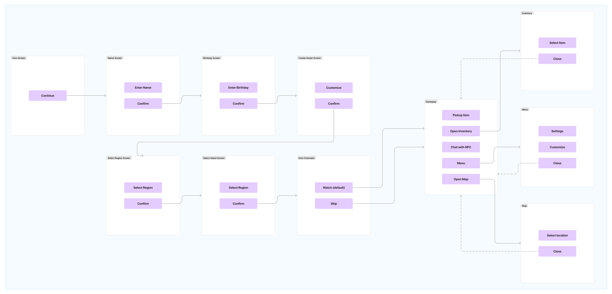
Paper Prototype & Flow Chart
Wireframes & Iterations
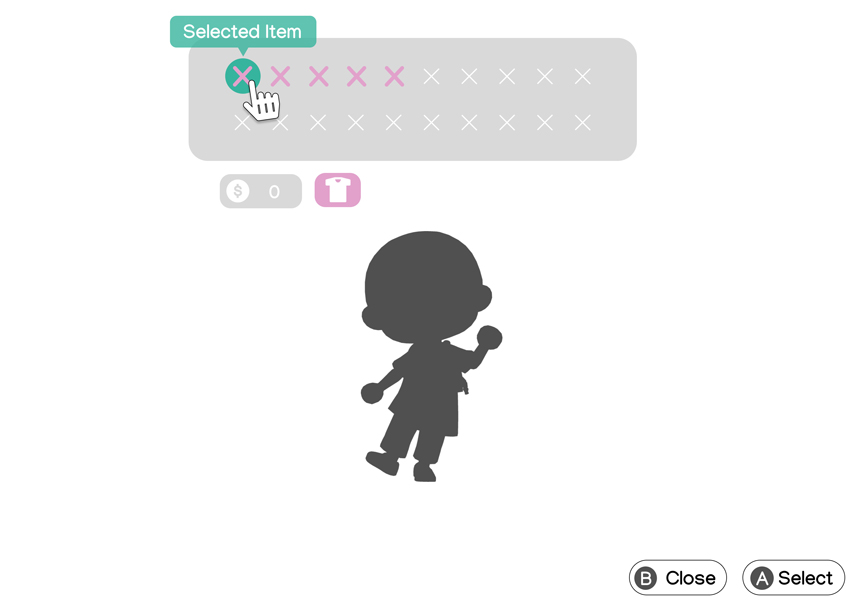
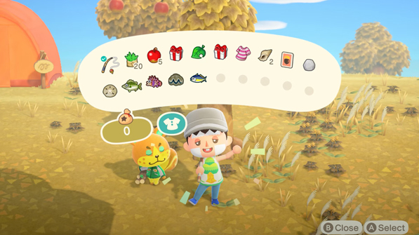
Inventory Screen 1
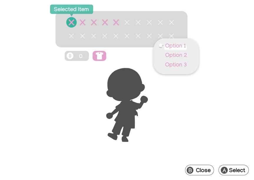
Inventory Screen 2
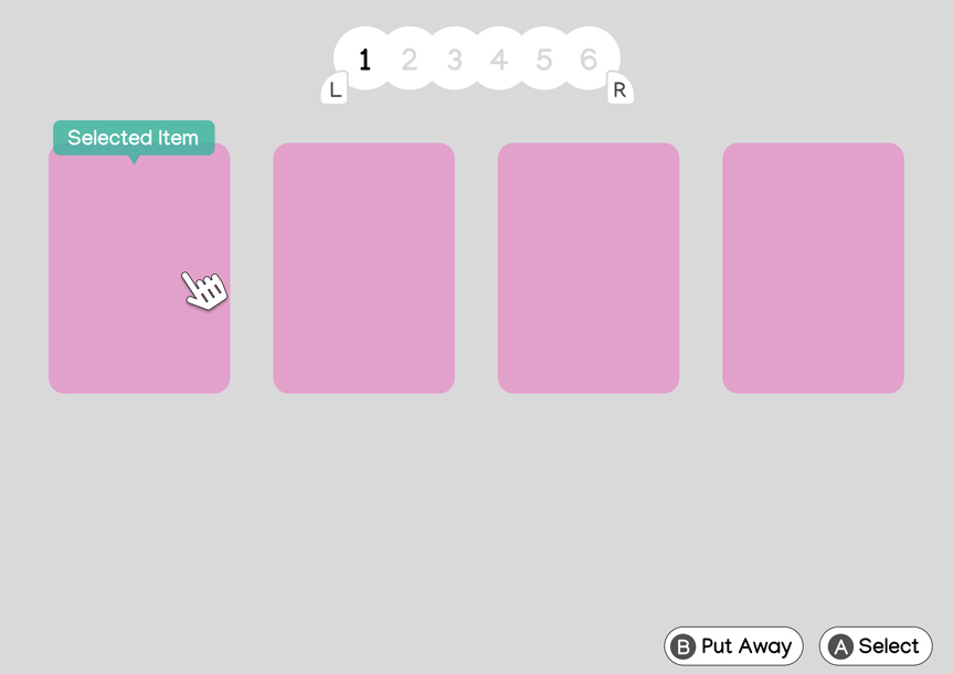
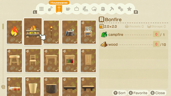
Crafting Screen 1
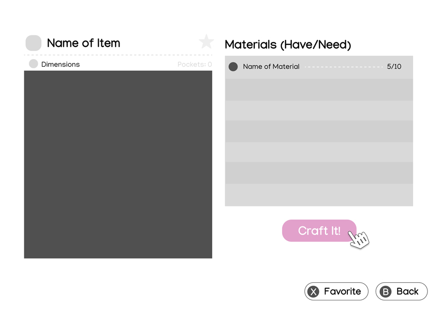
Crafting Screen 2
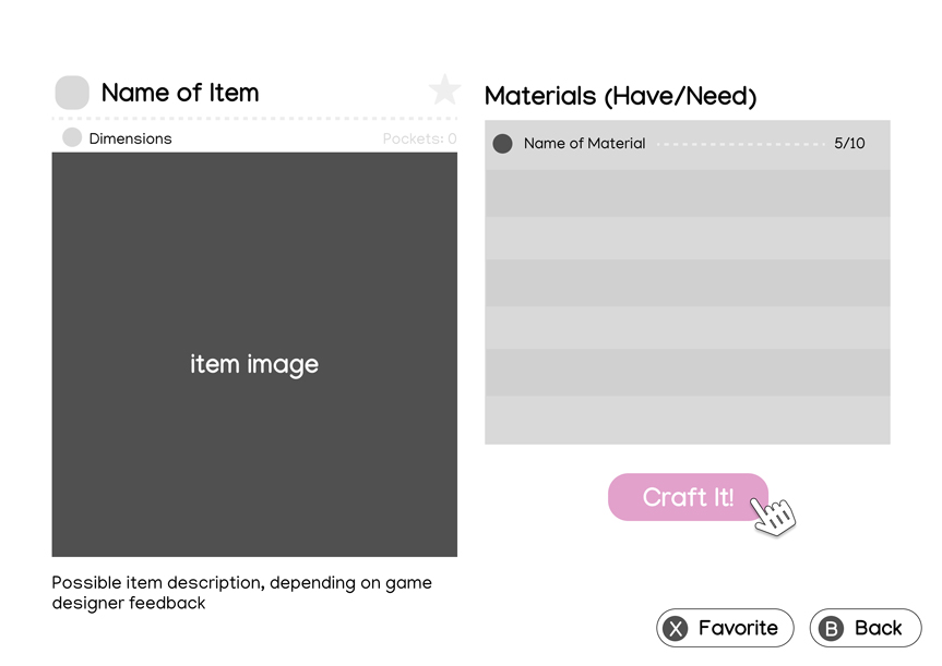
User Testing Feedback: There was some confusion around the crafting screen. Users were unsure what the item does and what the dark box was for, although my feedback was from mostly people who were unfamiliar with the game.
I would meet with the game designers to determine whether or not there should be an item description or something similar within the crafting menu. It may be excluded there for a reason, or make more sense to include somewhere else.
I labeled the box as an image to make it more clear and alleviate any confusion for future testing.
Iterated Wireframe:
Mood Board / References
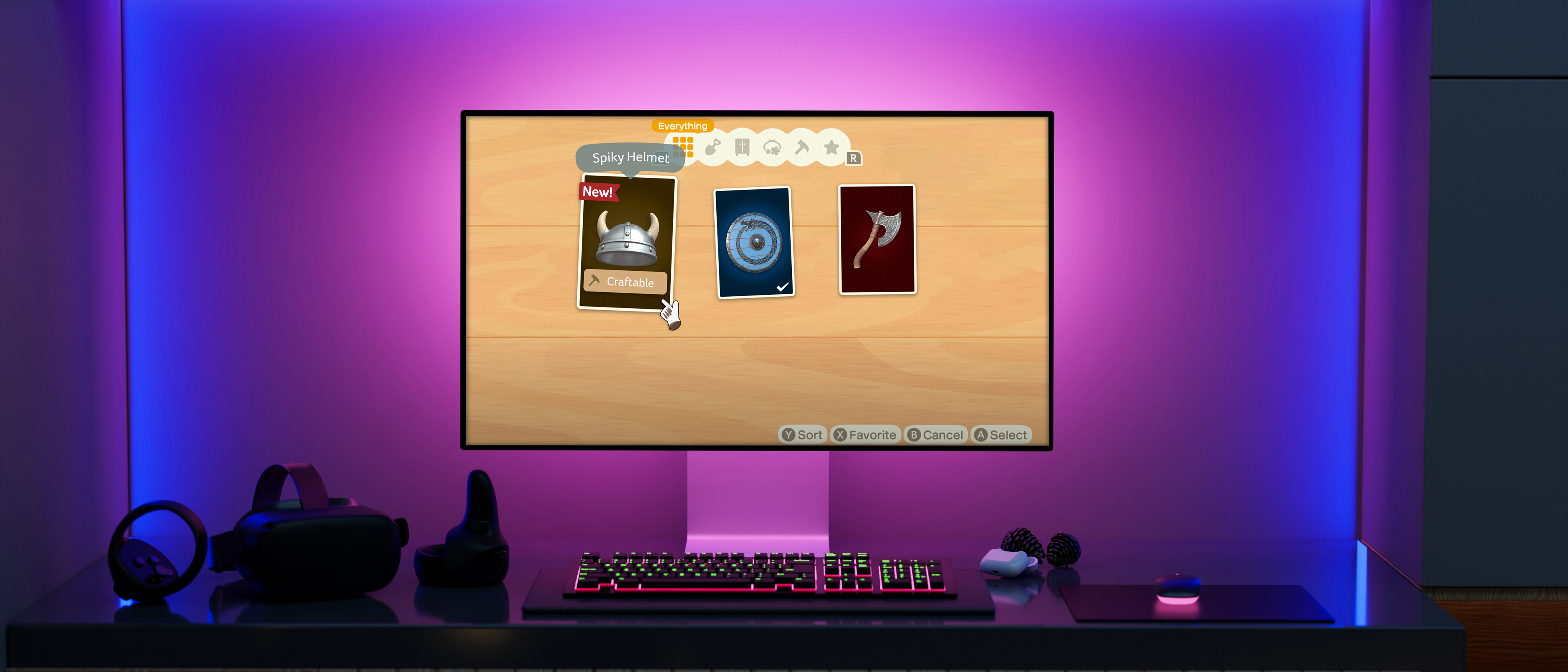
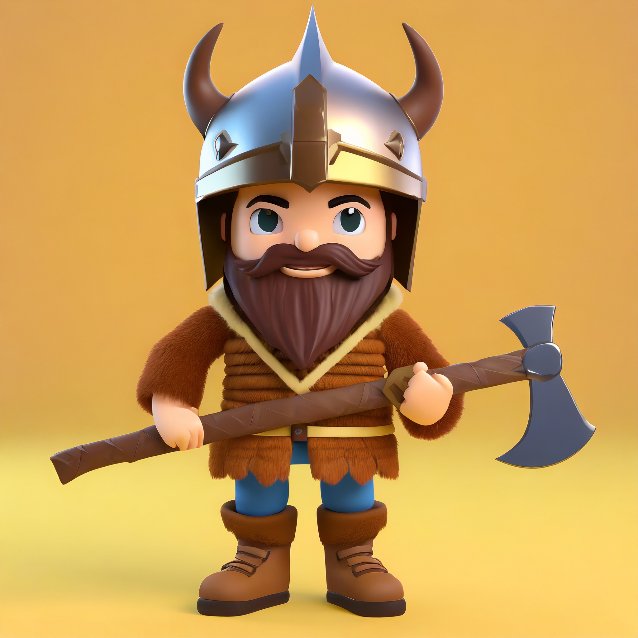
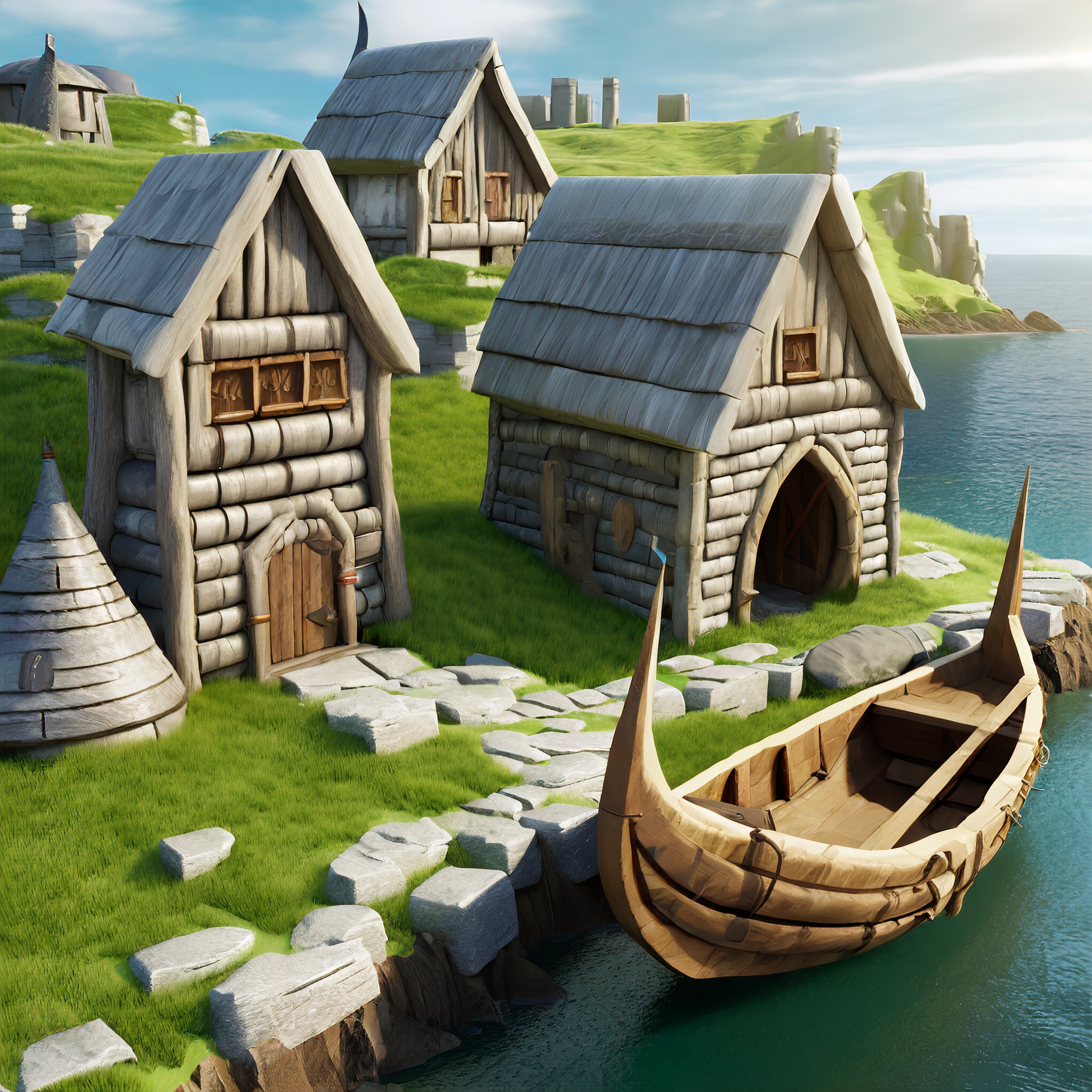
I wanted to give the game a new look while keeping a similar fun and friendly feel, so I studied how Animal Crossing used various elements throughout its interfaces and gameplay. I rendered some images of the viking characters I was going for in Adobe Firefly, and combined these studies to more of a viking style RPG using a variety of new assets.
Style Guide
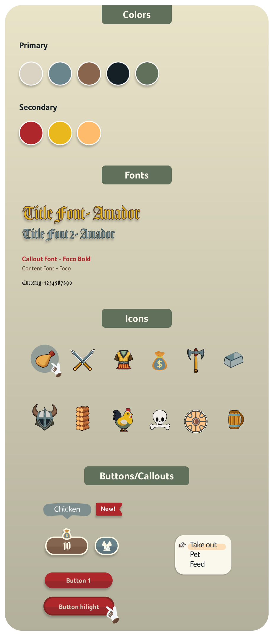
Because I was going for a different feel in this case study, I needed to change up the feel but keep a similar art style.
I needed a slightly darker pallet with pops of color here and there to keep things light.
I used the decorative font Amador (sparingly) for different titles across the game. For paragraph text and callouts, I used variations of the font Foco. This keeps things easy to read but adds an air of fun while matching viking feel.
I created various icons in illustrator, mainly for the inventory screens. I tried to match a similar art style that Animal Crossing used in its inventory screens.
Mockups
3D assets sourced from https://sketchfab.com/
Outcomes
Gained deeper understanding of user testing and how to iterate with feedback
Learned more about designing interfaces and assets for specific art styles
Gained valuable insight about inclusive design for a larger audience
Furthered understanding of design principles and how to apply them in game specific contexts
Post Mortem
This project was great in learning more about the process of UX/UI design for gaming. I had a great time thinking about the best way to present information, as well as creating different assets to match specific art styles. I would love to work more closely with game designers to get more insight as to how my designs would effect gameplay, and vice versa.