Doctors' Preferred Redesign

Product design
Overview
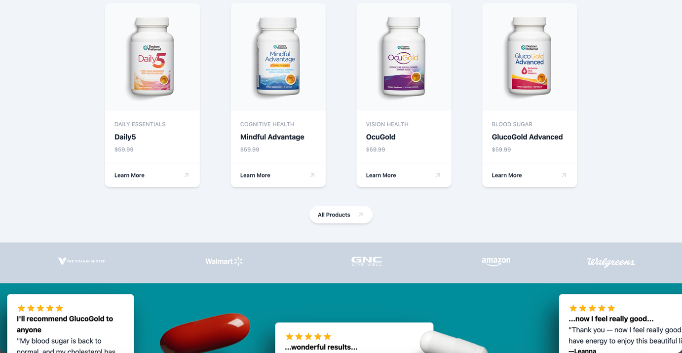
The existing webpage had plenty of useful content, but the experience felt dated and repetitive. Sections followed similar patterns, creating a long, monotonous scroll that made the page difficult to digest.

I saw an opportunity to rethink the page as a more cohesive, engaging experience rather than simply giving the existing design a visual refresh.

‍Role: Lead Designer + Front-End Implementation
Team: Marketing, Analytics
Scope: Design, front-end development, optimization, growth
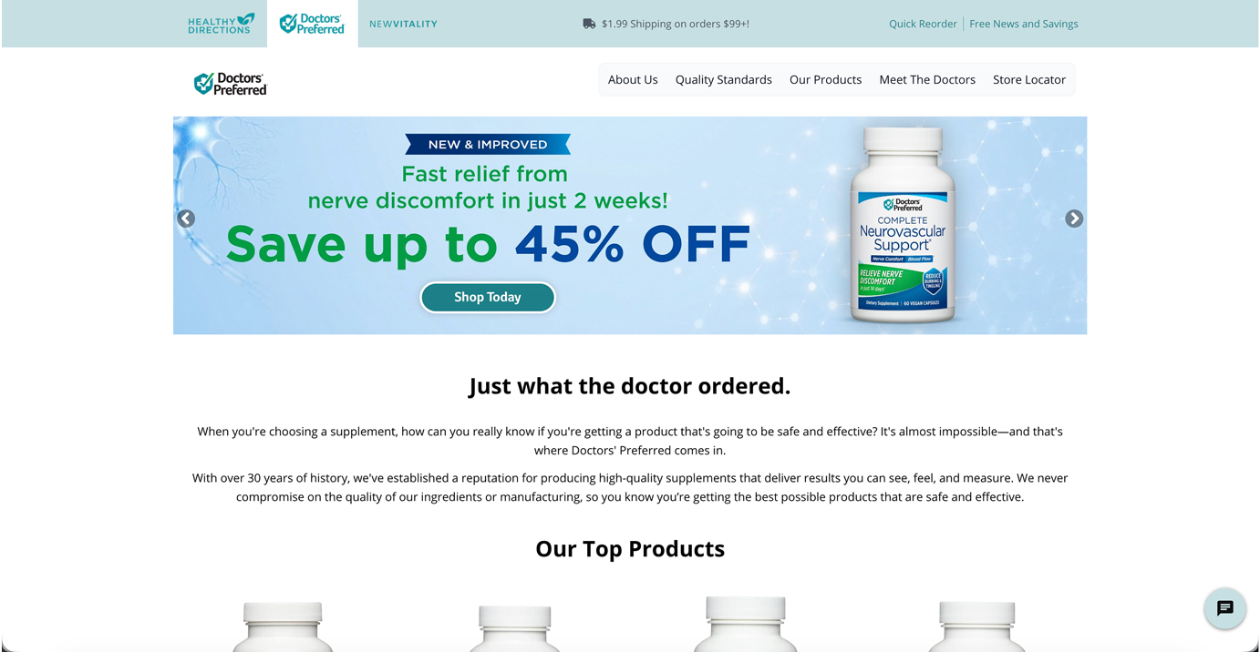
Old hero section
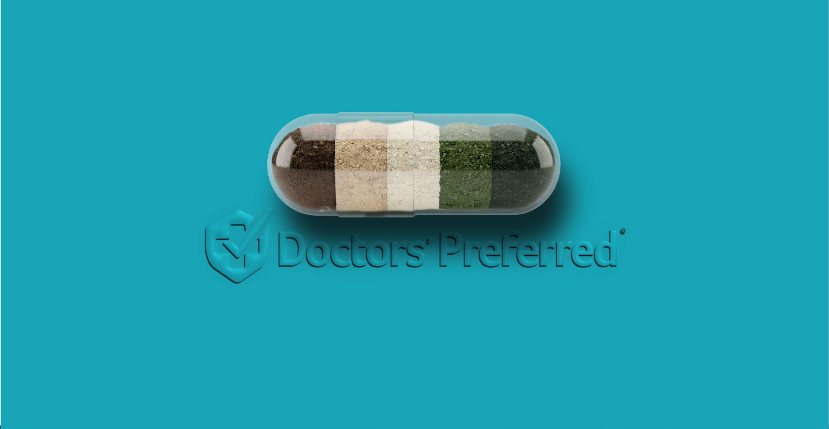
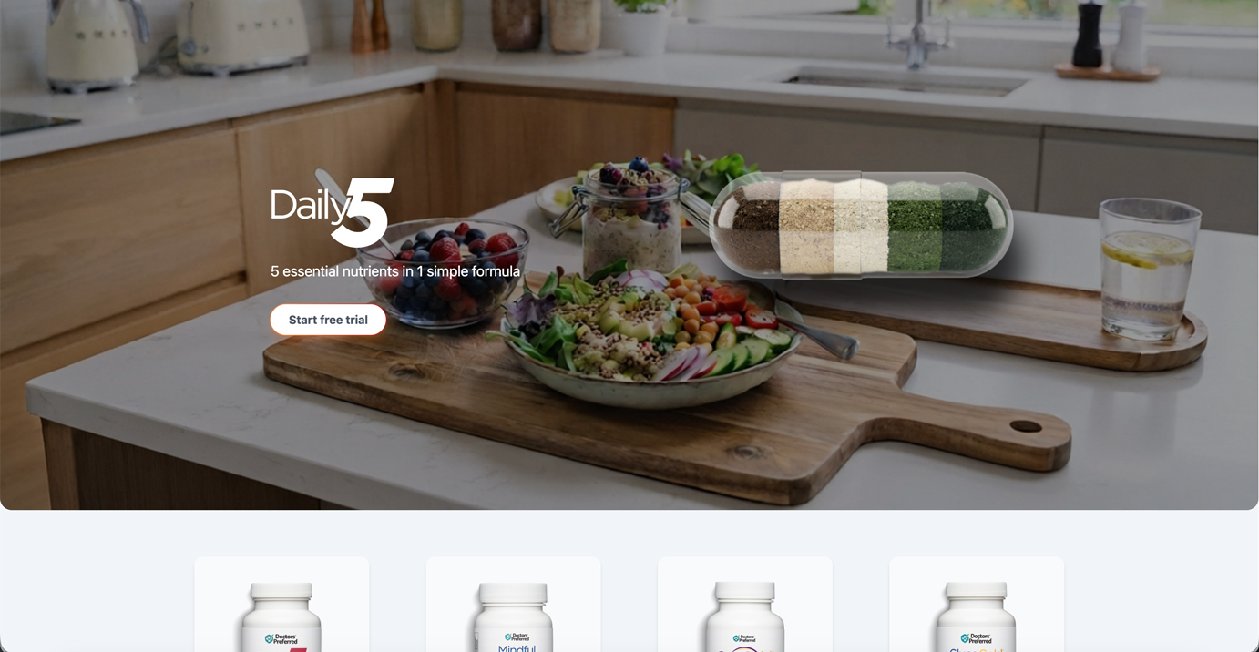
New hero section
The Problem
The original page was doing too much of the same thing.

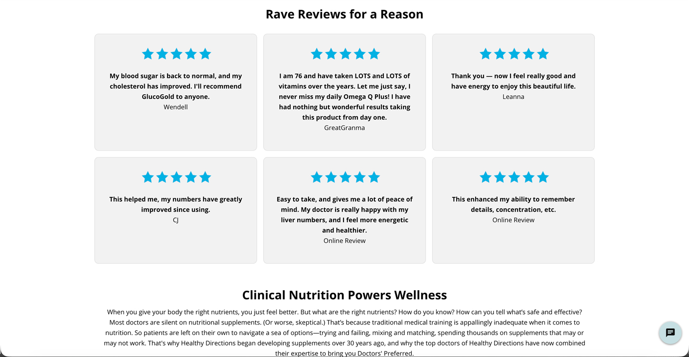
Repeated layouts and large blocks of static content created little visual distinction between sections. As a result, the page felt longer than necessary and important information could easily get lost.

There was also an opportunity to better connect the individual sections. Instead of feeling like a collection of independent content blocks, the page needed to feel like a single, intentional experience.
The Opportunity
Rather than redesigning each section in isolation, I approached the project from the perspective of the entire user journey through the page.

How could the design create a stronger sense of hierarchy?
How could users understand content more quickly?
And how could motion make a long page feel more dynamic without becoming distracting?
Old hero section
New hero section
Rethinking the Structure
The first step was establishing a stronger visual hierarchy.

I introduced more variation between sections while maintaining a consistent design language. Typography, spacing, imagery, and component treatments were brought into a more cohesive system so that the page felt intentional from top to bottom.

Content was also grouped more deliberately, allowing each section to communicate a specific idea rather than simply adding another block to the page.

The goal was to make the page easier to scan first and explore deeper.
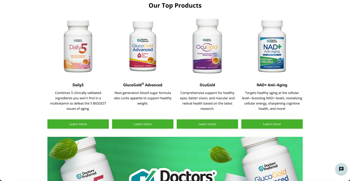
Old review section
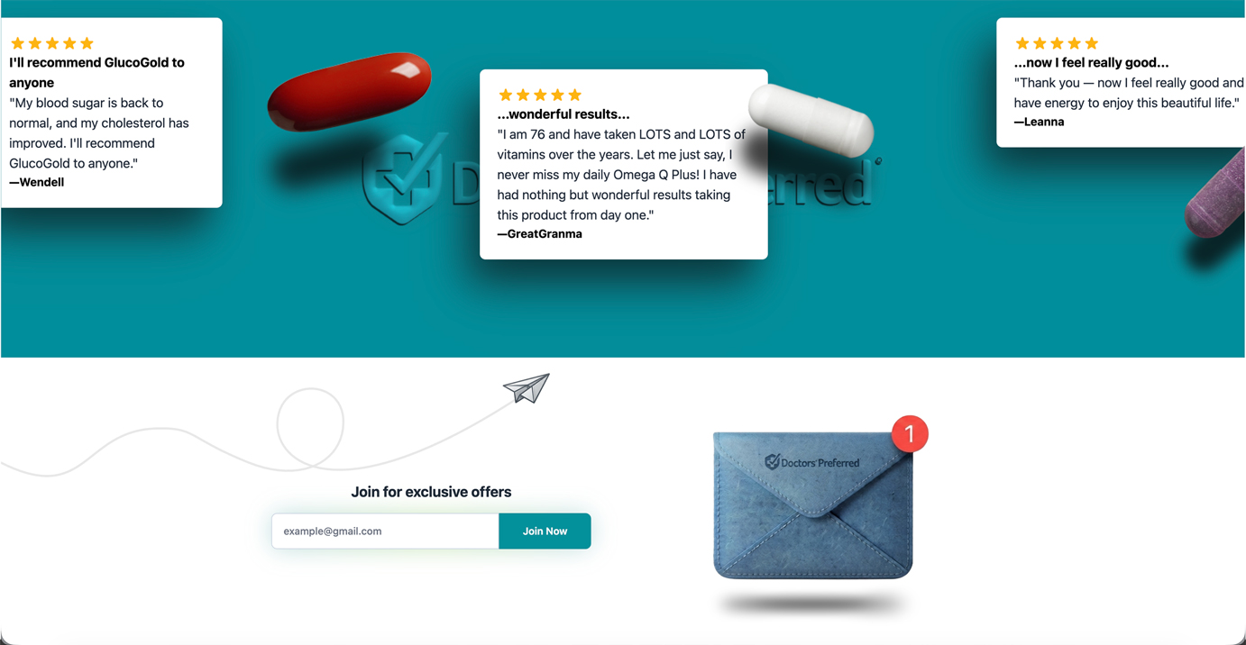
New review section
Designing for the Scroll
One of the biggest opportunities was the scrolling experience.

The original page was almost entirely static, which meant users were presented with the same visual treatment section after section. I wanted to use motion to create a stronger sense of progression.

Using GSAP I introduced subtle scroll-triggered animations that reveal and transition content as users move through the page.
‍
Rather than animating everything, I used motion selectively to:
  • Draw attention to important content
  • Create separation between sections
  • Establish a sense of progression
  • Break up long stretches of information
  • Make the experience feel more responsive and alive
The Final Experience
The final design gives the page a more contemporary visual identity while making the content easier to navigate and digest.

More importantly, the redesign wasn't simply about making the page look newer. It was about changing how the information is experienced.

Through clearer hierarchy, intentional content grouping, and purposeful animation, the page now provides users with a stronger visual path through the content.
The Takeaway
A successful redesign doesn't always require changing the content. Sometimes the biggest opportunity is changing how that content is presented, paced, and experienced.